Lexington Health

Overview

A scalable UX system for Lexington Health with improved consistency and access to essential care tools.

Challenge

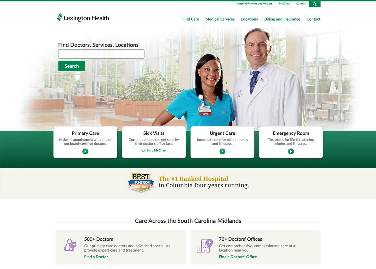
Lexington Health's site needed a redesign to better integrate with healthcare tools such as MyChart.

Solution

  • Enable users to quickly find the right care or information.
  • Prioritize search performance and discoverability.
  • Establish a clear, consistent, and scalable visual system.
  • Ensure full accessibility and mobile-first usability.
  • Reflect and support Lexington Health’s values and voice.
  • Design a system built to grow and stay relevant long-term.
  • Support organic growth with strong career and recruitment pathways.

Process

Research

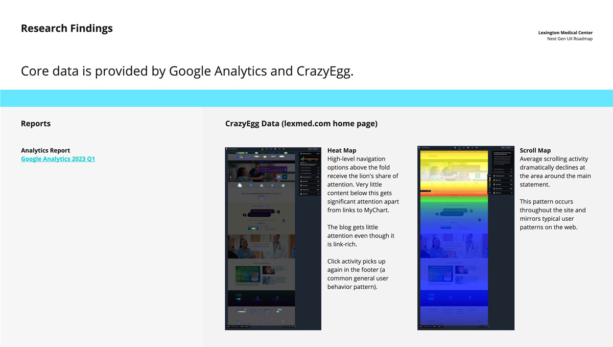
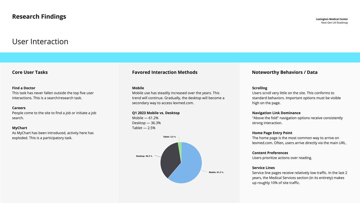
We conducted a detailed review of user behavior using Google Analytics and CrazyEgg. These insights informed design.

Lexington Health core data insights from Google Analytics and Crazy Egg. Users tend to look at the top half of a web page and spend less time at the bottom half.
Lexington Health user interaction data. They spend the most time on mobile. Their main tasks include find a doctor, careers, and MyChart.

Ideation and Prototyping

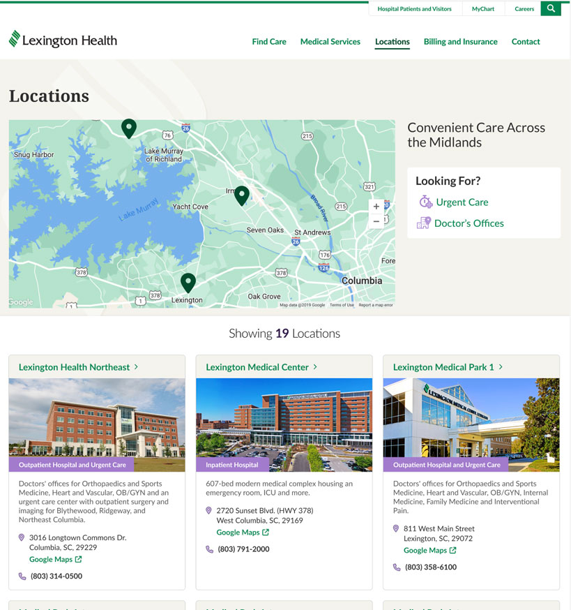
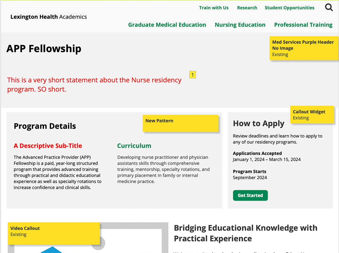
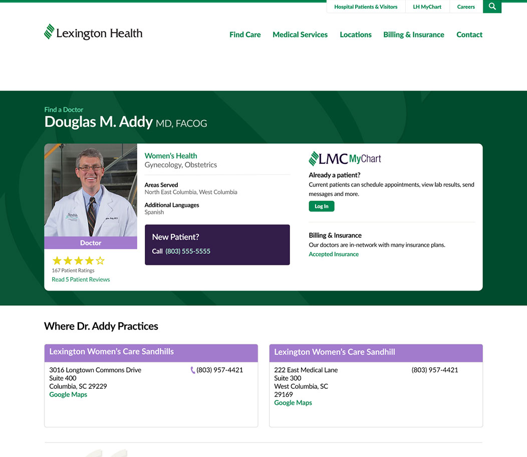
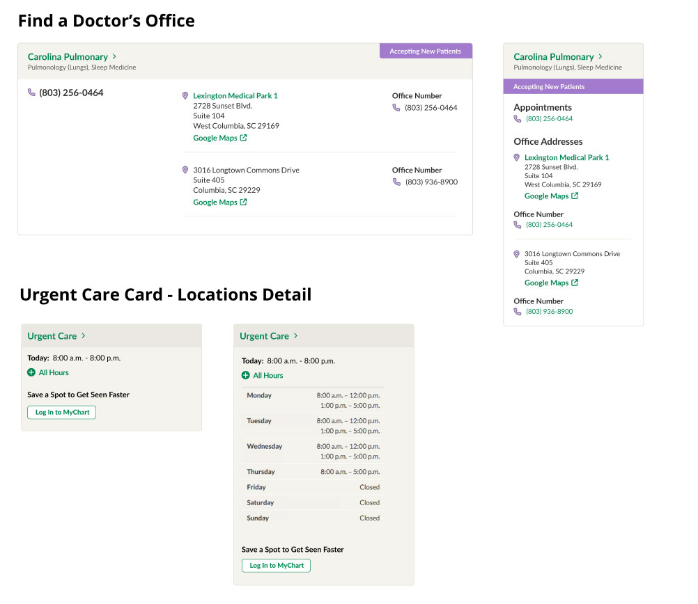
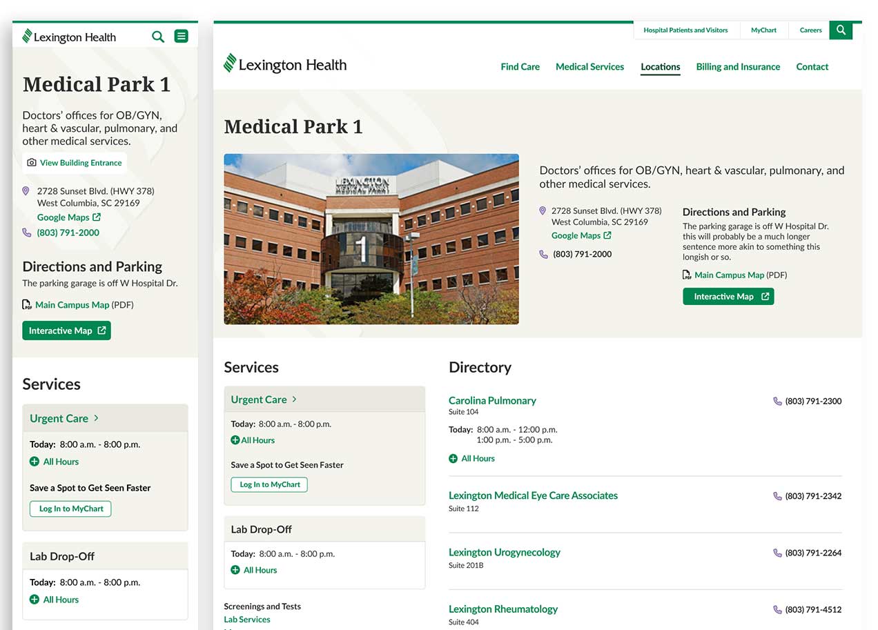
Standard Card Layout

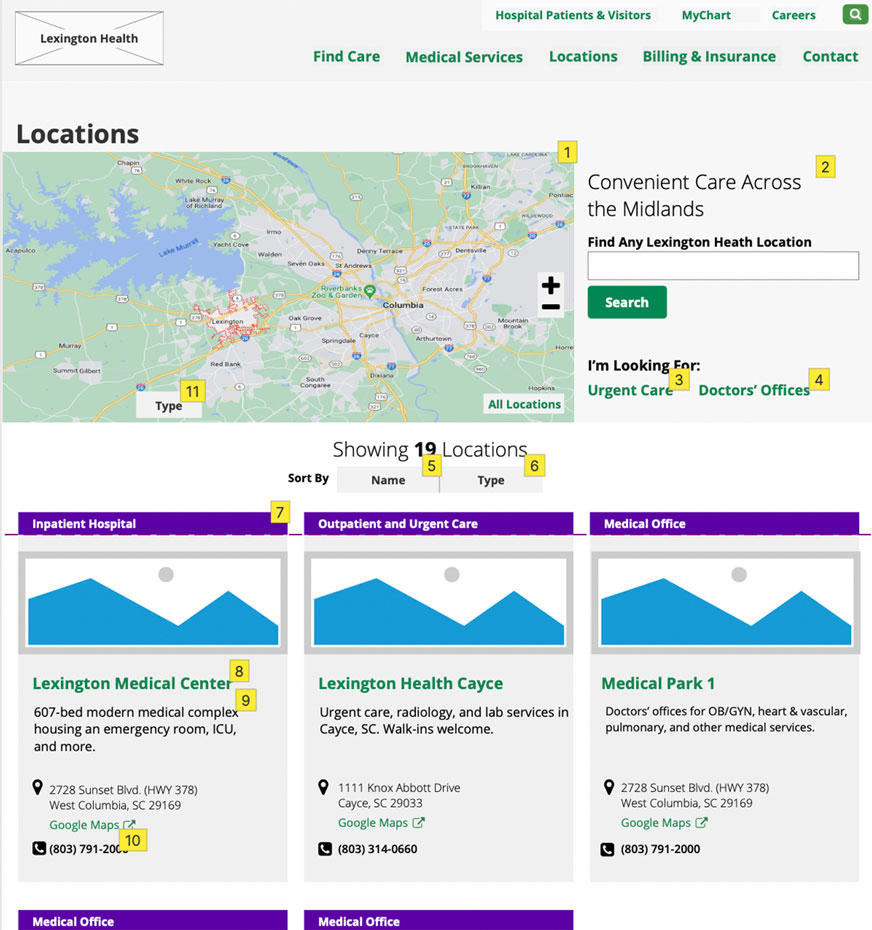
Through iterative prototyping and discussion, I proposed adopting a more standard card layout for the Locations page. 

Research showed that users prioritize identifying the correct location first, so the design emphasizes the location name and key details upfront for faster scanning.
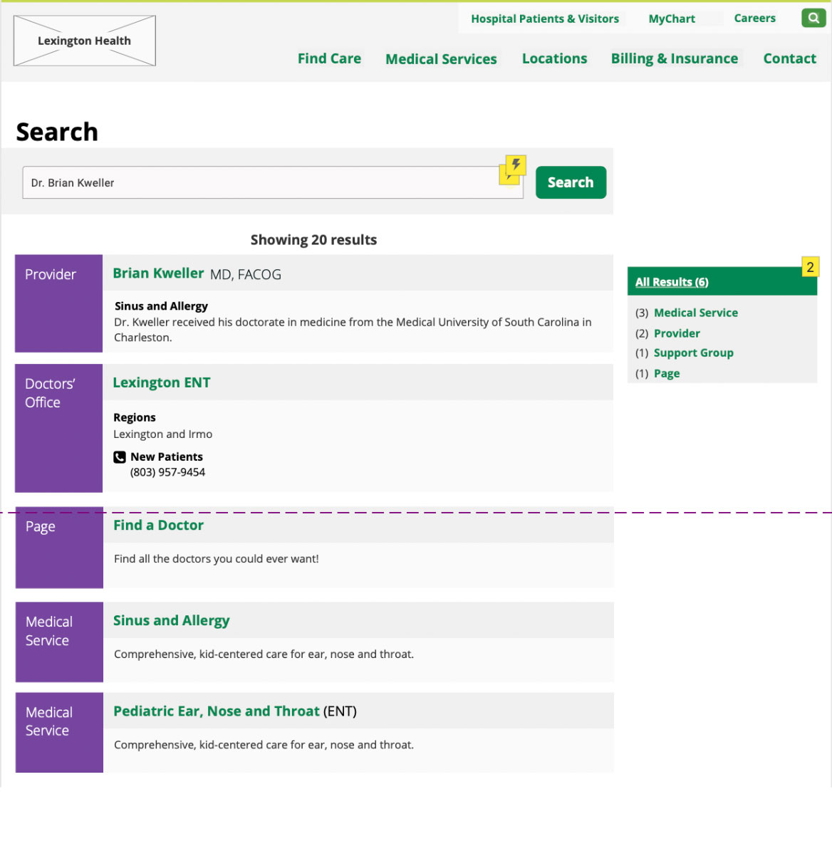
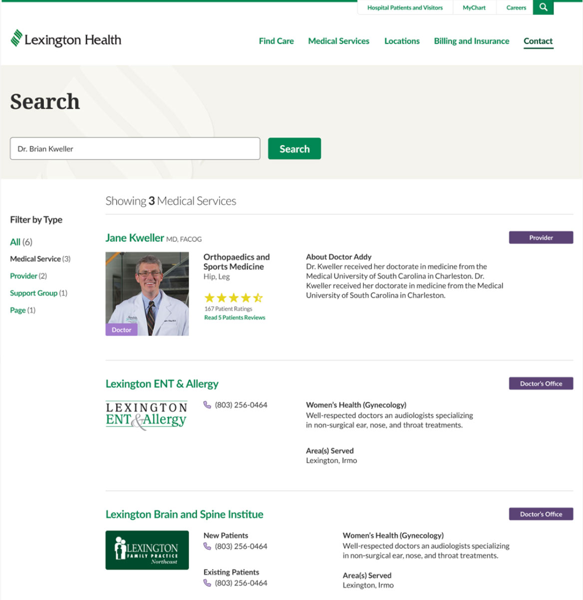
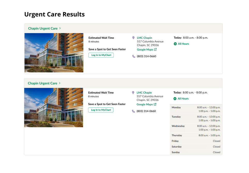
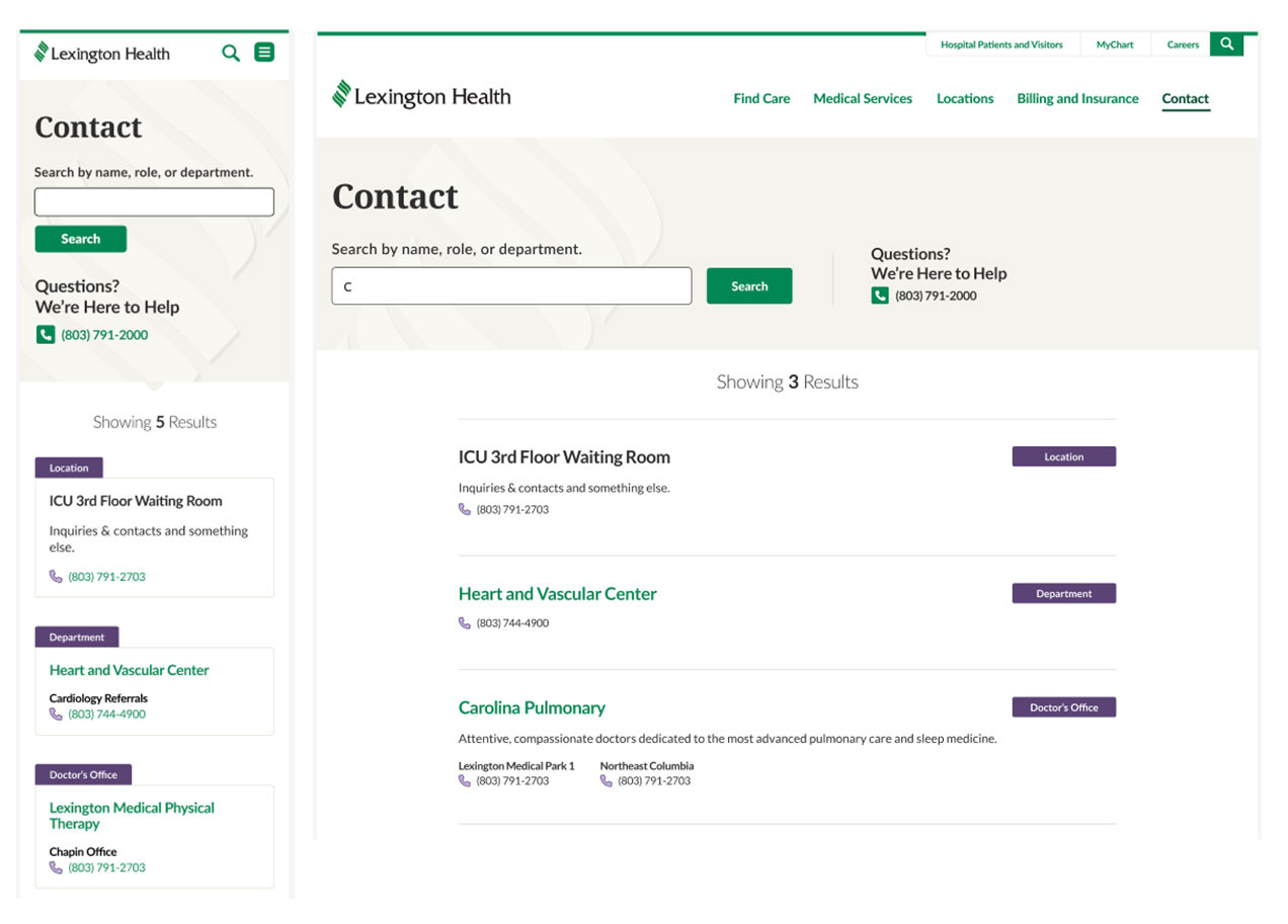
Website wireframe of the Lexington Health Locations page showing a map with multiple marked facilities, a sidebar with urgent care and doctor’s office filters, and a grid of hospital location cards with images and contact details.
Website mockup of the Lexington Health Locations page showing a map with multiple marked facilities, a sidebar with urgent care and doctor’s office filters, and a grid of hospital location cards with images and contact details.

Search Results

I redesigned Lexington Health’s search results for quick scanning and clear differentiation

Iterative feedback shaped decisions around visual hierarchy including horizontal layout, icons/images, and labels.

Website wireframe of the Lexington Health search results showing results to the left for "Dr. Brian Kweller".  There is a filter option to the right.
Website mockup of the Lexington Health search results showing results to the right for "Dr. Brian Kweller".  There is a filter option to the left.

Collaboration

Collaboration with a team of user experience experts, content strategists, designers, and developers guided many of the decisions behind the final design system. 

I worked with strategists and user experience experts to structure content in ways that matched user behavio, and partnered with developers to ensure that each component was practical to implement. Together, we iterated on patterns until they were both user-friendly and technically sound.

Definition and Design

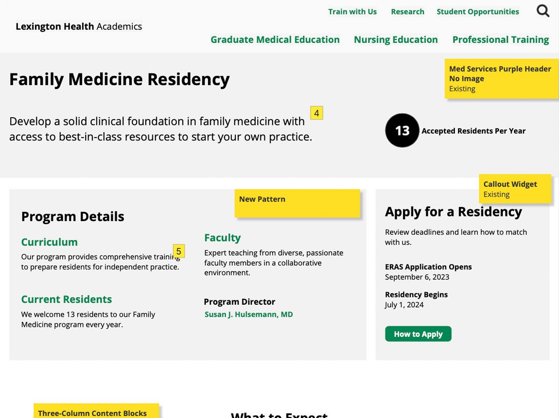
Creating a Consistent Page Architecture

Content types varied widely (medical services, locations, providers), making consistency a challenge.

Solution:

  • Designed flexible page templates.
  • Defined rules for hero areas, calls to action, and content blocks.
  • Created reusable components (cards, heros, buttons).
Website wireframe/template of the Lexington Health Academics, Family Medicine Residency page. There are program details and information for how to apply.
Website wireframe/template of the Lexington Health Academics APP Fellowship page. There are program details and information for how to apply.
Website mockup of the Lexington Health Academics, Family Medicine Residency page. There are program details and information for how to apply.
Website mockup of the Lexington Health Academics, APP Fellowship page. There are program details and information for how to apply.

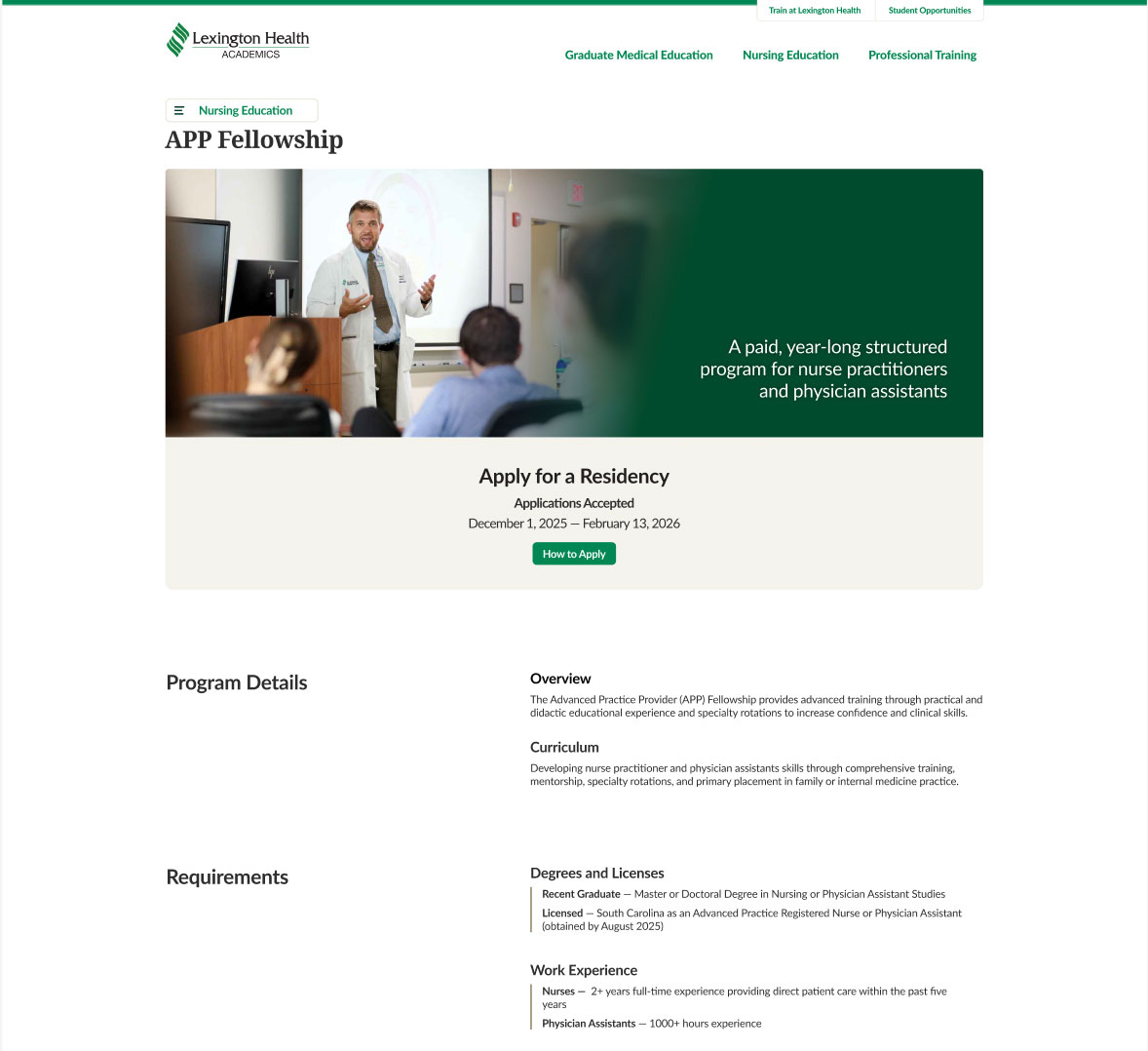
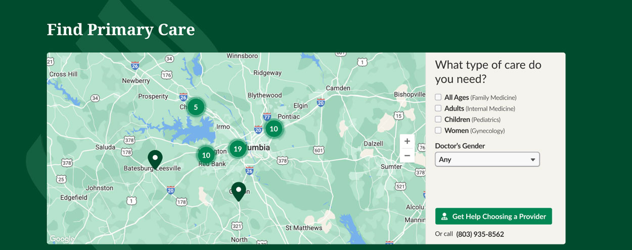
Simplifying Key Patient Journeys

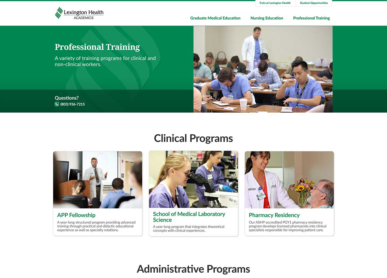
I streamlined card designs for doctors, locations, and other core components, ensuring that each followed a consistent structure and clear CTA pattern (green links and buttons).

This helped users move through the site more efficiently.
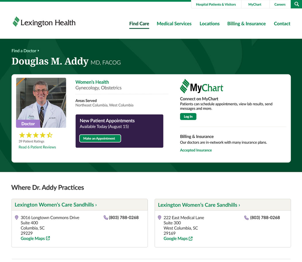
Doctor profile page with two location cards that look static, with light backgrounds and purple headers not aligning with the standard interactive color scheme.
Updated doctor profile page with redesigned location cards featuring higher contrast backgrounds, clearer borders, and green links and arrow indicators to show they are interactive links

Design System

The card system supported the entire site. This overview shows how the components worked together across different content types.

I designed a custom Google Maps theme that integrated seamlessly with the site’s color palette and component styles.
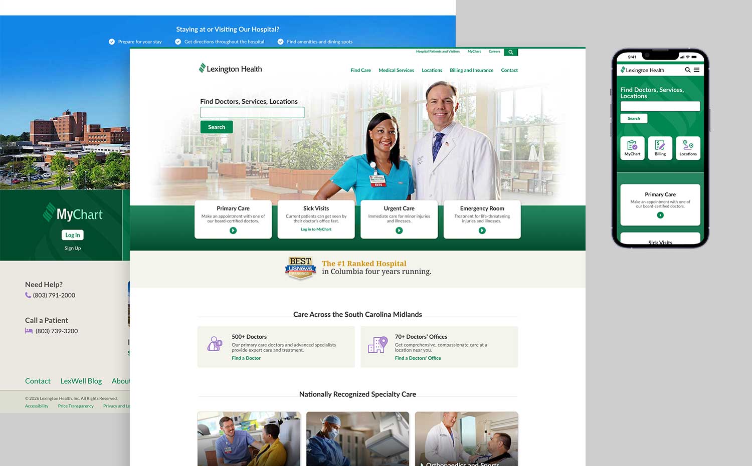
Card designs for Find a Doctor's Office and Urgent Care (locations detail). Each use similar color schemes and established designs for interaction (green links and arrows).
Card designs for Urgent Care Results cards. Each use similar color schemes and established designs for interaction (green links and arrows).
Example page with map styling for Lexington Health websites. It incorporates the company's color scheme including green and tan hues.

Final Design

Lexington Health home page with the option to search and ctas to primary care, sick visits, urgent care, and emergency room.
Example Urgent Care detail page mobile and desktop with an image of the location followed by address, contact, and a map option.
The mobile Contact page shows several results for the search, "C" with information about each result. Each result has a category such as "Location" or "Department".
Billing and insurance page with options for users to check your coverage, send payments, estimate costs, and get financial help.
Lexington Health Academics Professional Training page. The page has several images of students participating in programs such as APP Fellowship, School of Medicine, and Pharmacy Residency.

Impact

This project produced a clear and consistent experience across 60+ pages and strengthened the main patient pathways. The component system helped streamline development and support future growth. Performance data will be reviewed once the site has been live longer.

This project strengthened my ability to collaborate with a diverse team. By designing over 60 pages I grew in my familiarity with Figma and development friendly design.